이제는 지금까지 공부한 내용을 바탕으로 채팅 어플리케이션을 만들어보겠습니다.
이번 장에서는 채팅을 동작시키기 위한 최소한 의 기능만구현해보겠습니다.
• 로그인/회원가입 : 이메일과 비밀번호를 이용한 로그인과 회원가입
• 프로필: 나의 정보 확인 및 변경
• 채널 생성: 채널 생성 기능
• 채널 목록: 생성된 채널들의 목록 조회
• 채널: 실시간으로 메시지를 송수신하는 독립된 공간
실습 준비를 해봅시다.
npx create-expo-app react-native-simple-chat
cd react-native-navigation
#react 스니펫 참고
https://mariedays.tistory.com/216
리액트 템플릿 자동완성 스니펫 / 자주 사용하는 스니펫 / ES7+ React/Redux/React-Native snippets / VS Code ex
Visual Studio Code에서 ES7+ React/Redux/React-Native snippets를 설치해 주세요 템플릿이 자동완성되어 시간 단축에 좋습니다. 자주 사용하는 스니펫 Basic Methods ✅ imp import moduleName from 'module' ✅ nfn const function
mariedays.tistory.com
1. 내비게이션
1) 화면 구조
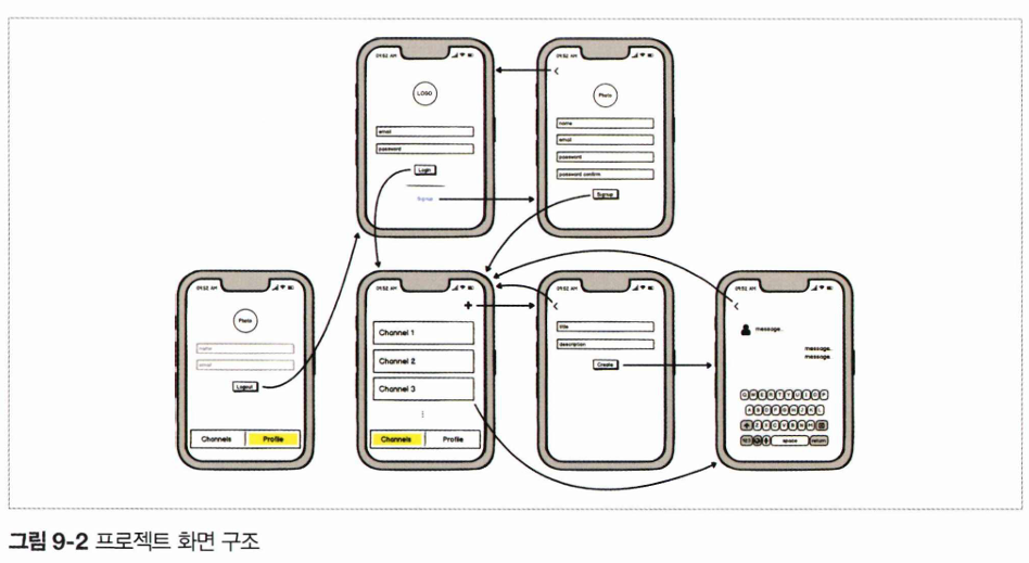
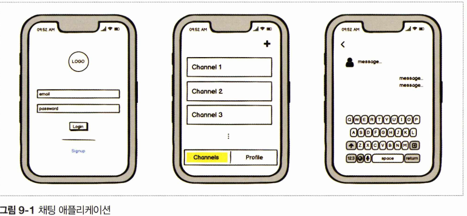
- 로그인 화면 (Login Screen)
- 로고
- 이메일 및 비밀번호 입력
- 로그인 버튼
- 회원가입(Signup) 링크
- 회원가입 화면 (Signup Screen)
- 프로필 사진
- 이름, 이메일, 비밀번호, 비밀번호 확인 입력 필드
- 가입 (Signup) 버튼
- 프로필 화면 (Profile Screen)
- 프로필 정보 표시 (이름 등)
- 로그아웃 버튼
- 채널 목록 화면 (Channels Screen)
- 채널 리스트 (Channel 1, Channel 2, Channel 3 등)
- '+' 버튼 (새로운 채널 추가)
- 하단 탭 메뉴 (Channels, Profile)
- 채널 생성 화면 (Create Channel Screen)
- 채널명 입력 필드
- 설명 입력 필드
- 생성 (Create) 버튼
- 채팅 화면 (Chat Screen)
- 사용자 아이콘
- 채팅 메시지 목록
- 메시지 입력 필드 및 키보드
2) 의존성 설치
//내비게이션을 관리하고 화면 간 전환
npm install @react-navigation/native

//React Navigation이 원활하게 동작하도록 도와주는 필수 패키지
expo install react-native-gesture-handler react-native-reanimated react-native-screens react-native-safe-area-context @react-native-community/masked-view

//스택, 탭 내비게이션 라이브러리
npm install @react-navigation/stack @react-navigation/bottom-tabs

//컴포넌트에 스타일 적용, props 타입검사
npm install styled-components prop-types
각 라이브러리의 역할
- react-native-gesture-handler
- 제스처(탭, 스와이프, 드래그 등)를 감지하고 처리하는 라이브러리
- 내비게이션에서 화면을 스와이프로 닫는 기능 등에 사용됨
- react-native-reanimated
- 애니메이션을 최적화하여 부드럽게 동작하도록 도와주는 라이브러리
- 내비게이션 전환 애니메이션 등에 활용됨
- react-native-screens
- 네이티브 화면 컴포넌트를 사용하여 성능을 향상시킴
- 화면 전환 시 부드러운 UX를 제공
- react-native-safe-area-context
- iPhone X 이상 기기의 Notch(노치) 영역 및 안전 영역을 감지하여 UI가 적절히 배치되도록 도와줌
- @react-native-community/masked-view
- 마스크 효과를 적용하는 UI 관련 라이브러리
- Stack Navigator에서 트랜지션 효과를 구현할 때 사용됨
추가적인 라이브러리는 사용되는 곳을 명확하게 알기 위해 필요한 상황이 오면 설치하고 사용하겠습니다.
• expo-image-picker: https://bit.ly/expo-imagepicker
• moment: https : //momentj s. com/
• react-native-keyboard-aware-scroll-view: https : //bit. ly/keyboard-scroll
• react-native-gifted-chat: https : //bit. ly/gif ted -chat
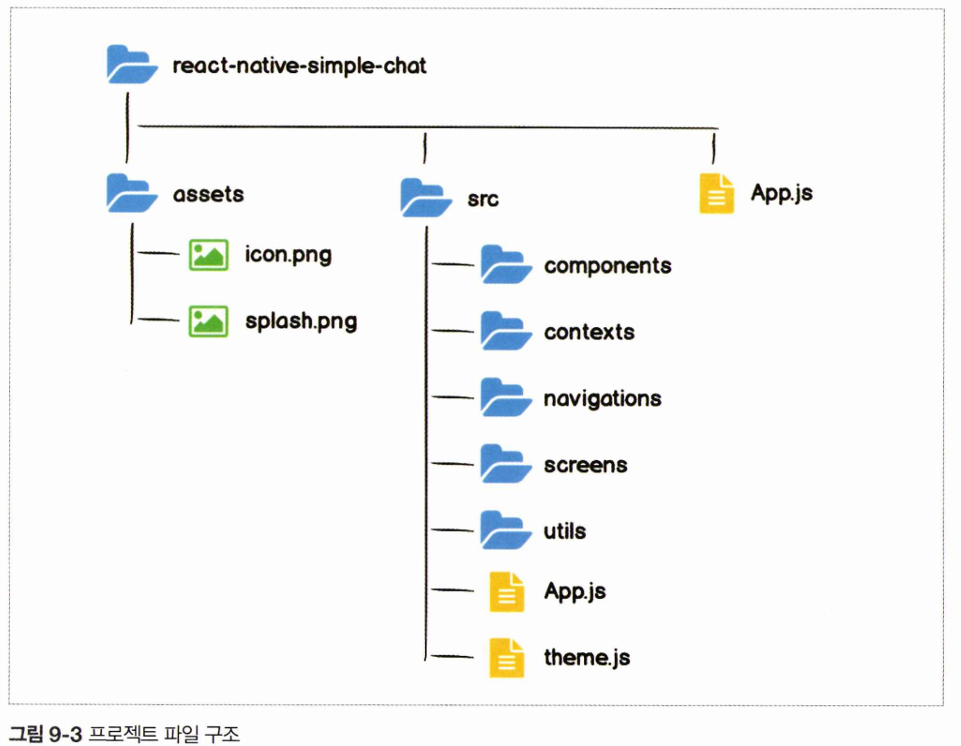
3) 프로젝트 파일 구조
-src/App.js 설정을 합니다.
import App from '../../src/App';

export default App;
-먼저 src/App.js React Native에서 테마(스타일)를 정의하는 객체를 만들어봅시다.
theme 객체는 현재 앱의 전체적인 색상을 정의합니다. scss에서 변수(variable)로 색상들을 관리하는 것과 같습니다.
const colors = {
    white:'#ffffff',
    black: '#000000',
    grey_0: '#d5d5d5',
    grey_1: '#a6a6a6',
    red: '#e84118',
    blue: '#3679fe',
};

export const theme = {
    background: colors.white,
    text: colors.black,
}
-src/App.js
import App from '../../src/App';

export default App;
4) src 아래 폴더 생성
• components: 컴포넌트파일관리
• contexts: Context API 파일 관리
• navigations: 내비게이션파일관리
• screens: 화면 파일 관리
• utils: 프로젝트에서 이용할 기타 기능 관리
2. 파이어베이스
파이어베이스란)
https://codingapple.com/unit/why-use-firebase/
Firebase 쓰는 이유 (약팔이 영상) - 코딩애플 온라인 강좌
우리가 흔히말하는 '웹서버'는 그냥 데이터 꺼내달라고 하면 데이터 꺼내주는 기계입니다. 서버가 있어야 회원 정보를 데이터베이스에 저장하고 뽑을 수 있고 그래야 웹서비스를 제작가능합
codingapple.com
파이어베이스Firebase는 인증Authentication, 데이터베이스Database 등의 다양한 기능을 제공하는 개 발 플랫폼입니다. 파이어베이스가 제공하는 기능을 이용하면 대부분의 서비스에서 필요한 서 버와 데이터베이스를 직접 구축하지 않아도 개발이 가능하다는 장점이 있습니다. 이번 장에서 는 별도의 서버 구축 없이 파이어베이스를 이용해 프로젝트를 진행하겠습니다.
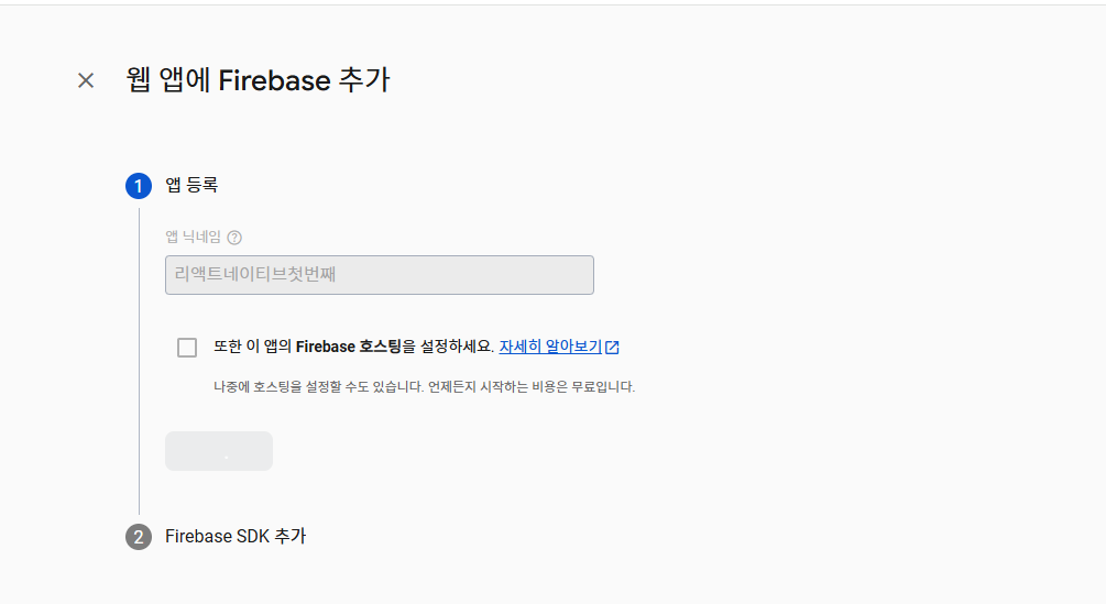
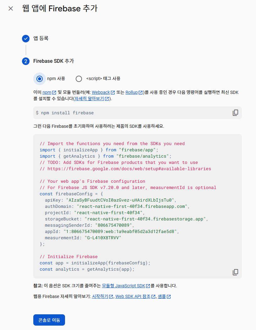
앱 추가가 완료된 후 “프로젝트 설정 ► 일반 ► 내 앱”에서 “Firebase SDK snippet”을 확인 하면 파이어베이스를 사용하기 위한 설정값을 확인할 수 있습니다. 해당 값을 프로젝트 루트 디렉터리에 firebase.json 파일을 만들어 삽입합니다.
JSON 파일에서 속성 키(property key)는 **항상 큰따옴표(" ")**로 감싸야 한다는 것을 주의하며 작성해봅시다.
{
  "apiKey": "your-api-key",
  "authDomain": "your-app.firebaseapp.com",
  "databaseURL": "https://your-app.firebaseio.com",
  "projectId": "your-project-id",
  "storageBucket": "your-app.appspot.com",
  "messagingSenderId": "your-messaging-sender-id",
  "appId": "your-app-id"
}
해당 파일은 노출되면 안되는 파일이므로 gitignore를 사용해 깃허브에 올라가지 않도록 주의합시다.
# firebase
firebase.json
-인증
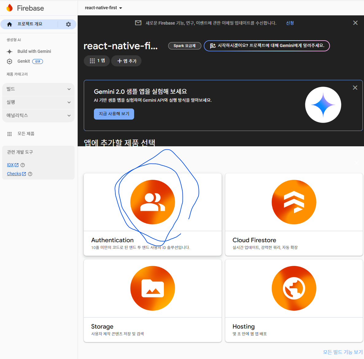
시작하기 누르고 들어가서 이메일/비밀번호 부분을 활성화합니다.

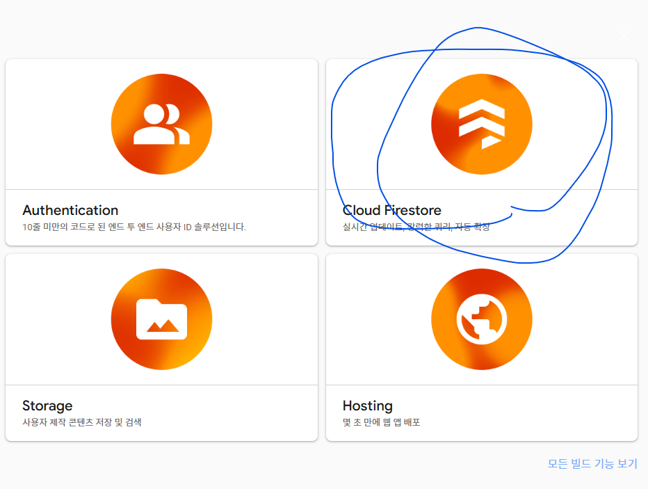
-데이터베이스
여기서는 생성되는 채널과 각 채널에서 발생하는 메시지를, 파이어베이스의 데이터베이스를 이용하여 관리합니다.
데이터베이스의 경우 파이어스토어 CloudFire5t*와 실시간 데이터베이스 Realtime Database 두 가지 종류를 제공하는데, 우리는 파이어스토어를 이용할 것입니다.
데이터베이스 만들기를 누르고 asia-northeast3(서울)로 위치를 설정합니다.
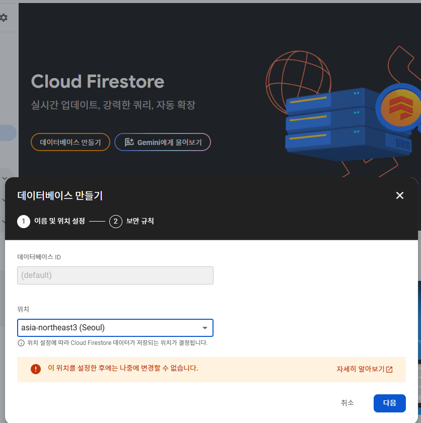
보안규칙을 설정할 수 있 도록 프로모션 모드를 선택합시다.
-스토리지 사용 설정
스토리지는 서버 코드 없이 사용자의 사진, 동영상 등을 저장할 수 있는 기능을 쉽게 개발할 수 있도록 기능을 제공합니다. 여기서는 스토리지를 이용해서 채팅 애플리케이션에 가입한 사용자의 사진을 저장하고 가져오는 기능을 만들 예정입니다.
스토리지는 결제를 해야 사용할 수 있지만 무료로 300어치를 주므로 그것을 이용해 실습해봅시다.
설정했다면 터미널에서 firebase 라이브러리를 설치하고
npx expo install firebase
src/firebase.js 에 다음 내용을 적습니다.
// 최신 Firebase 방식 (v9 이상)
import { initializeApp } from 'firebase/app';
import config from '../../firebase.json';

// Firebase 앱 초기화
const app = initializeApp(config);

export default app;
앞으로 프로젝트에서 사용할 이미지와 폰트fom를 미 리 불러와서 사용할 수 있도록 cacheimages 와 cacheFonts 함수를 작성하고 이를 이용해 _loadAssets 함수를 구성했습니다. 이미지나 폰트를 미리 불러오면 애플리케이션을 사용하는 환경에 따라 이미지나 폰트가 느리게 적용되 는 문제를 개선할 수 있습니다
npx expo install expo-splash-screen
src/App.js
import React, { useState } from 'react';
import { StatusBar, Image } from 'react-native';
import AppLoading from 'expo-app-loading';
import { Asset } from 'expo-asset';
import * as Font from 'expo-font';
import { ThemeProvider } from 'styled-components';
import { theme } from './theme';

const cacheImages = (images) => {
  return images.map((image) => {
    if (typeof image === 'string') {
      return Image.prefetch(image);
    } else {
      return Asset.fromModule(image).downloadAsync();
    }
  });
};

const cacheFonts = (fonts) => {
  return fonts.map((font) => Font.loadAsync(font));
};

const App = () => {
  const [isReady, setIsReady] = useState(false);

  const _loadAssets = async () => {
    const imageAssets = cacheImages([require('../assets/splash.png')]);
    const fontAssets = cacheFonts([]);

    await Promise.all([...imageAssets, ...fontAssets]);
  };

  return isReady ? (
    <ThemeProvider theme={theme}>
      <StatusBar barStyle="dark-content" />
    </ThemeProvider>
  ) : (
    <AppLoading startAsync={_loadAssets} onFinish={() => setIsReady(true)} onError={console.warn} />
  );
};

export default App;
expo 개발된 버전에서는 splash화면을 확인 할 수 없습니다.
expo-app-loading이 곧 없어질 것이라 expo-splash-screen로 바꾸어 사용하는 것을 추천합니다. 저는 책에 나온 그대로 사용했지만 expo-splash-screen를 사용하고 싶다면 아래 링크를 참고해주세요.
https://docs.expo.dev/versions/latest/sdk/splash-screen/
SplashScreen
A library that provides access to controlling the visibility behavior of native splash screen.
docs.expo.dev
이번에는 로딩 화면에서 기기의 크기에 따라 주변에 흰색 바탕이 보이는 것을 방지하기 위해, 로딩 화면의 배경색을 로딩 화면 이미지의 배경색과 동일하게 변경하겠습니다
//app.json
{
  "expo": {
    "name": "react-native-simple-chat",
    "slug": "react-native-simple-chat",
    "version": "1.0.0",
    "orientation": "portrait",
    "icon": "./assets/images/icon.png",
    "scheme": "myapp",
    "userInterfaceStyle": "automatic",
    "splash": {
      "image": "./assets/splash.png",
      "resizeMode": "cover",
      "backgroundColor": "#3679fe"
    },
    "newArchEnabled": true,
    "ios": {
      "supportsTablet": true
    },
    "android": {
      "adaptiveIcon": {
        "foregroundImage": "./assets/images/adaptive-icon.png",
        "backgroundColor": "#ffffff"
      }
    },
    "web": {
      "bundler": "metro",
      "output": "static",
      "favicon": "./assets/images/favicon.png"
    },
    "plugins": [
      "expo-router",
      [
        "expo-splash-screen",
        {
          "image": "./assets/images/splash-icon.png",
          "imageWidth": 200,
          "resizeMode": "contain",
          "backgroundColor": "#ffffff"
        }
      ]
    ],
    "experiments": {
      "typedRoutes": true
    }
  }
}
4. 인증화면
이번에는 파이어베이스 인증 기능을 이용해 로그인 화면과 회원가입 화면을 만들어보겠습니다.
인증을 위해 이메일과 비밀번호가 필요하므로 로그인 및 회원가입 화면에서는 이메일과 비밀 번호를 필수로 입력받고, 회원가입 시 사용자가 서비스에서 사용할 이름과 프로필 사진을 받도 록 화면을 구성하겠습니다.
1) 내비게이션
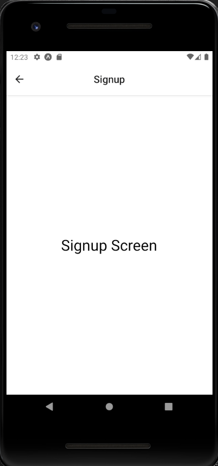
screens/Signup.js
import React from 'react';
import styled from 'styled-components/native';
import { Text } from 'react-native';

const Container = styled.View`
  flex: 1;
  justify-content: center;
  align-items: center;
  background-color: ${({ theme }) => theme.background};
`;

const Signup = () => {
  return (
    <Container>
      <Text style={{ fontSize: 30 }}>Signup Screen</Text>
    </Container>
  );
};

export default Signup;
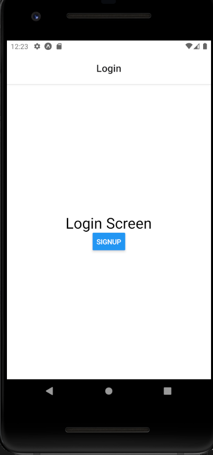
screens/Login.js
import React from 'react';
import styled from 'styled-components/native';
import {Text, Button} from 'react-native';

const Container = styled.View`
    flex: 1;
    justify-content: center;
    align-items: center;
    background-color: ${({theme}) => theme.background};
`;

const Login = () => {
  return (
    <Container>
        <Text style={{fontSize: 30}}>Login Screen</Text>
        <Button title="Signup" onPress={() => NavigationPreloadManager.navigate('Signup')}/>
    </Container>
  )
}

export default Login
screens/index.js
import Login from './Login';
import Signup from './Signup';

export {Login, Signup};
//navigations/index.js
import React from 'react';
import { NavigationContainer } from '@react-navigation/native';
import AuthStack from './AuthStack';

const Navigation = () => {
    return (
            <AuthStack />
    );
};

export default Navigation;
//navigations/AuthStack.js
import React, { useContext } from 'react';
import { ThemeContext } from 'styled-components/native';
import { createStackNavigator } from '@react-navigation/stack';
import { Login, Signup } from '../screens';

const Stack = createStackNavigator();

const AuthStack = () => {
    const theme = useContext(ThemeContext);

    return (
        <Stack.Navigator
            initialRouteName="Login"
            screenOptions={{
                headerTitleAlign: 'center',
                cardStyle: { backgroundColor: theme?.background },
            }}
        >
            <Stack.Screen name="Login" component={Login} />
            <Stack.Screen name="Signup" component={Signup} />
        </Stack.Navigator>
    );
};

export default AuthStack;
//App.js
import Navigation from './navigations';

//...
  return isReady ? (
    <ThemeProvider theme={theme}>
      <StatusBar barStyle="dark-content" />
      <Navigation />
    </ThemeProvider>
2) 로그인 화면
로그인 화면에서는 로고를 렌더링하는 컴포넌트와 사용자의 입력을 받는 컴포넌 트, 그리고 클릭과 그에 따른 이벤트가 발생하는 컴포넌트가 필요합니다.
-Image 컴포넌트
props로 전달되는 url을 렌더 링하고 imageStyle을 전달받아 컴포넌트의 스타일을 수정할 수 있는 Image 컴포넌트를 만들었습니다.
import React from 'react';
import styled from 'styled-components/native';
import PropTypes from 'prop-types';

const Container = styled.View`
    align-self: center;
    margin-bottom: 30px;
`
const StyledImage = styled.Image`
    background-color: ${({theme})=> theme.imageBackground};
    width: 100px;
    height: 100px;
`

const Image = ({url, imageStyle}) => {
    return (
        <Container>
            <StyledImage source={{uri: url}} style={imageStyle} />
        </Container>
    );

};

Image.propTypes = {
    uri: PropTypes.string,
    imageStyle: PropTypes.object,
};

export default Image;
Image 컴포넌트 작성이 완료되면 components 폴더 에 index.js 파일을 생성하고 다음과 같이 작성합니다.
import Image from './Image';
export {Image};
여기까지 이미지가 적절하게 삽입되는지 확인해봅시다.
//screens/Login.js
import {Text, Button} from 'react-native';
import {Image} from '../components';
//...
const Login = ({navigation}) => {
  return (
    <Container>
        <Text style={{fontSize: 30}}>Login Screen</Text>
        <Image/>
        <Button title="Signup" onPress={() => navigation.navigate('Signup')}/>
여기까지 이미지가 적절하게 삽입되는지 확인해봅시다. theme.js에 이미지 배경색을 넣습니다 회색이 나오면 정상적으로 이미지 컴포넌트가 위치하는 것입니다.
const colors = {
    white:'#ffffff',
    black: '#000000',
    grey_0: '#d5d5d5',
    grey_1: '#a6a6a6',
    red: '#e84118',
    blue: '#3679fe',
};

export const theme = {
    background: colors.white,
    text: colors.black,
    imageBackground: colors.grey_0,
}
-파이어베이스에서 로고 이미지 가져와서 적용하기
앞에서 작성한 Image 컴포넌트의 크기인 100x100보다 큰 사이 즈로 로고 이미지를 준비하고, 파일을 파이어베이스의 스토리지에 업로드합니다. 저는 200 x 200 사이즈의 이미지를 사용했습니다.
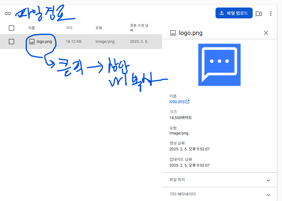
파이어베이스 storage에 해당 파일을 업로드합니다.

스토리지에 파일을 업로드하고 파일 정보에서 이름을 클릭하면 새탭으로 이동합니다. 해당 탭의 url에서 token부분을 제외하고 /o까지 복사하십시오.
utils/images.js
const prefix = '
';

export const images = {
    logo: `${prefix}/logo.png?alt=media`
}
이제 로고 이미지도 로딩 과정에 서 미리 불러오도록 App 컴포넌트를 다음과 같이 수정하겠습니다.
import React, { useState } from 'react';
import { StatusBar, Image } from 'react-native';
import AppLoading from 'expo-app-loading';
import { Asset } from 'expo-asset';
import * as Font from 'expo-font';
import { ThemeProvider } from 'styled-components';
import { theme } from './theme';
import Navigation from './navigations';
import {images} from './utils/images';

const cacheImages = (images) => {
  return images.map((image) => {
    if (typeof image === 'string') {
      return Image.prefetch(image);
    } else {
      return Asset.fromModule(image).downloadAsync();
    }
  });
};

const cacheFonts = (fonts) => {
  return fonts.map((font) => Font.loadAsync(font));
};

const App = () => {
  const [isReady, setIsReady] = useState(false);

  const _loadAssets = async () => {
    const imageAssets = cacheImages([require('../assets/splash.png'), ...Object.values(images),]);
    const fontAssets = cacheFonts([]);

    await Promise.all([...imageAssets, ...fontAssets]);
  };

  return isReady ? (
    <ThemeProvider theme={theme}>
      <StatusBar barStyle="dark-content" />
      <Navigation />
    </ThemeProvider>
  ) : (
    <AppLoading startAsync={_loadAssets} onFinish={() => setIsReady(true)} onError={console.warn} />
  );
};

export default App;
//screens/Login.js
import React from 'react';
import styled from 'styled-components/native';
import {Text, Button} from 'react-native';
import {Image} from '../components';
import {images} from '../utils/images';

const Container = styled.View`
    flex: 1;
    justify-content: center;
    align-items: center;
    background-color: ${({theme}) => theme.background};
`;

const Login = ({navigation}) => {
  const temp ='https://firebasestorage.googleapis.com/v0/b/react-native-first-40f34.firebasestorage.app/o'
  return (
    <Container>
        <Text style={{fontSize: 30}}>Login Screen</Text>
        <Image url={images.logo} imageStyle={{ borderRadius: 8 }} />
        <Button title="Signup" onPress={() => navigation.navigate('Signup')}/>
    </Container>
  )
}

export default Login
자 이제 Storage의 rules(규칙)에 가서 보안 규칙을 수정해봅시다.
rules_version = '2';

// Craft rules based on data in your Firestore database
// allow write: if firestore.get(
//    /databases/(default)/documents/users/$(request.auth.uid)).data.isAdmin;
service firebase.storage {
  match /b/{bucket}/o {
     match /logo.png {
      allow read;  // logo.png에 대해 읽기 허용
    }

    match /{allPaths=**} {
      allow read, write: if false; // 다른 모든 경로는 차단
    }
  }
}
만약 이미지가 안보인다면 안드로이드 애뮬레이터가 제대로 동작하지 않을 수도 있으므로 컴퓨터를 다시 시작해봅시다.
theme.js
const colors = {
    white: '#ffffff',
    black: '#000000',
    grey_0: '#d5d5d5',
    grey_1: '#a6a6a6',
    red: '#e84118',
    blue: '#3679fe',
};

export const theme = {
    background: colors.white,
    text: colors.black,
    errorText: colors.red,
    imageBackground : colors.grey_0,
    imageButtonBackgroud: colors.grey_1,
    imageButtonIcon: colors.white,
    label: colors.grey_1,
    inputPlaceholder: colors.grey_1,
    inputBorder: colors.grey_1,
    inputDisabledBackground: colors.grey_0,
    buttonBackground: colors.blue,
    buttonTitle: colors.white,
    buttonUnfilledTitle: colors.blue,
    buttonLogout: colors.red,
    headerTintColor: colors.black,
    tabActiveColor: colors.blue,
    tabInactiveColor: colors.grey_1,
    spinnerBackground: colors.black,
    spinnerIndicator: colors.white,
    listBorder: colors.grey_0,
    listTime: colors.grey_1,
    listDescription: colors.grey_1,
    listIcon: colors.black,
    sendButtonActive: colors.blue,
    sendButtonInActive: colors.grey_1,
};
//components/Input.js
import React, { useState } from 'react';
import styled from 'styled-components/native';
import PropTypes from 'prop-types';

const Container = styled.View`
  flex-direction: column;
  width: 100%;
  margin: 1px 0;
`;

const Label = styled.Text`
  font-size: 14px;
  font-weight: 600;
  margin-bottom: 6px;
  color: ${({ theme, isFocused }) => (isFocused ? theme.text : theme.label)};
`;

const StyledTextInput = styled.TextInput.attrs(({ theme }) => ({
  placeholderTextColor: theme.inputPlaceholder,
}))`
  background-color: ${({ theme }) => theme.background};
  color: ${({ theme }) => theme.text};
  padding: 2px 10px;
  font-size: 16px;
  border: 1px solid ${({ theme, isFocused }) => (isFocused ? theme.text : theme.inputBorder)};
  border-radius: 4px;
`;

const Input = ({
    label,
    value,
    onChangeText,
    onSubmitEditing,
    onBlur = () => {},
    placeholder,
    isPassword,
    returnKeyType,
    maxLength,
  }) => {
    const [isFocused, setIsFocused] = useState(false);

    return (
      <Container>
        <Label isFocused={isFocused}>{label}</Label>
        <StyledTextInput
          value={value}
          onChangeText={onChangeText}
          onSubmitEditing={onSubmitEditing}
          onFocus={() => setIsFocused(true)}
          onBlur={() => {
            setIsFocused(false);
            onBlur();
          }}
          placeholder={placeholder}
          secureTextEntry={isPassword}
          returnKeyType={returnKeyType}
          maxLength={maxLength}
          autoCapitalize="none"
          autoCorrect={false}
          textContentType="none" // iOS only
          underlineColorAndroid="transparent" // Android only
        />
      </Container>
    );
  };


Input.defaultProps = {
  onBlur: () => {},
};

Input.propTypes = {
  label: PropTypes.string.isRequired,
  value: PropTypes.string.isRequired,
  onChangeText: PropTypes.func.isRequired,
  onSubmitEditing: PropTypes.func.isRequired,
  onBlur: PropTypes.func,
  placeholder: PropTypes.string,
  isPassword: PropTypes.bool,
  returnKeyType: PropTypes.oneOf(['done', 'next']),
  maxLength: PropTypes.number,
};

export default Input;
라벨을 Textinput 컴포넌트 위에 렌더링하고 포커스 여부에 따라 스타일이 변경되는 Input 컴포넌트를 만들었습니다. secureTextEntry 속성은 입력되는 문자를 감추는 기능으로 비밀 번호를 입 력하는 곳에서 많이 사용됩니 다. Input 컴포넌트 작성 이 완료되면 components 폴 더의 index.js 파일을 다음과 같이 수정합니다.
import Image from './Image';
import Input from './Input';
export {Image, Input};
이제 사용자의 이메일과 비밀번호를 입력받을 수 있도록 Input 컴포넌트를 이용해 로그인 화 면을 다음과 같이 수정하겠습니다
//Login.js
import React, {useState,useRef} from 'react';
import styled from 'styled-components/native';
import {Text, Button} from 'react-native';
import {Image, Input} from '../components';
import {images} from '../utils/images';

const Container = styled.View`
    flex: 1;
    justify-content: center;
    align-items: center;
    background-color: ${({theme}) => theme.background};
    padding: 20px;
`;

const Login = ({navigation}) => {
  const [email, setEmail] =useState('');
  const [password, setPassword] = useState('');
  const passwordRef = useRef();

  return (
    <Container>
        <Image url={images.logo} imageStyle={{ borderRadius: 8 }} />
        <Input
          label="Email"
          value={email}
          onChangeText={text => setEmail(text)}
          onSubmitEditing={() => {passwordRef.current.focus()}}
          placeholder="Email"
          returnKeyType="next"
        />

        <Input
          ref={passwordRef}
          label="Password"
          value={password}
          onChangeText={text => setPassword(text)}
          onSubmitEditing={() => {}}
          placeholder="Password"
          returnKeyType="done"
          isPassword
        />

        <Button title="Signup" onPress={() => navigation.navigate('Signup')}/>
    </Container>
  )
}

export default Login
입력되는 이메일과 비밀번호를 관리할 email과 password를 useState 함수로 생성하고 각각 이메일과 비밀번호를 입력받는 Input 컴포넌트의 value로 지정했습니다. 비밀번호를 입력 받 는 Input 컴포넌트는 입력되는 값이 보이지 않도록 isPassword 속성을 추가했습니다
로그인 화면에서 이메일을 입력받는 Input 컴포넌트의 returnKeyType을 next로 설정하고 비밀번호를 입력받는 Input 컴포넌트는 done으로 설정했습니다. 이번에는 useRef를 이용해 이메일을 입력받는 Input 컴포넌트에서 키보드의 next 버튼을 클릭하면 비밀번호를 입력하는 Input 컴포넌트로 포커스가 이동되는 기능을 추가하겠습니다
onSubmitEditing은 사용자가 Email 입력 필드에서 "Enter" 키(또는 모바일에서 "다음" 키)를 눌렀을 때 호출됩니다.
ref={passwordRef}로 password Input 컴포넌트 인스턴스를 참조, 직접 접근하여 email Input 컴포넌트에서 enter를 누르면 password 입력 필드로 포커스가 이동됩니다.
components/Input.js
import React, { useState,forwardRef } from 'react';
import styled from 'styled-components/native';
import PropTypes from 'prop-types';

const Container = styled.View`
  flex-direction: column;
  width: 100%;
  margin: 1px 0;
`;

const Label = styled.Text`
  font-size: 14px;
  font-weight: 600;
  margin-bottom: 6px;
  color: ${({ theme, isFocused }) => (isFocused ? theme.text : theme.label)};
`;

const StyledTextInput = styled.TextInput.attrs(({ theme }) => ({
  placeholderTextColor: theme.inputPlaceholder,
}))`
  background-color: ${({ theme }) => theme.background};
  color: ${({ theme }) => theme.text};
  padding: 2px 10px;
  font-size: 16px;
  border: 1px solid ${({ theme, isFocused }) => (isFocused ? theme.text : theme.inputBorder)};
  border-radius: 4px;
`;

const Input = forwardRef(({
    label,
    value,
    onChangeText,
    onSubmitEditing,
    onBlur = () => {},
    placeholder,
    isPassword,
    returnKeyType,
    maxLength,
  }, ref

) => {
    const [isFocused, setIsFocused] = useState(false);

    return (
      <Container>
        <Label isFocused={isFocused}>{label}</Label>
        <StyledTextInput
            ref={ref}
          value={value}
          onChangeText={onChangeText}
          onSubmitEditing={onSubmitEditing}
          onFocus={() => setIsFocused(true)}
          onBlur={() => {
            setIsFocused(false);
            onBlur();
          }}
          placeholder={placeholder}
          secureTextEntry={isPassword}
          returnKeyType={returnKeyType}
          maxLength={maxLength}
          autoCapitalize="none"
          autoCorrect={false}
          textContentType="none" // iOS only
          underlineColorAndroid="transparent" // Android only
        />
      </Container>
    );
  });


Input.defaultProps = {
  onBlur: () => {},
};

Input.propTypes = {
  label: PropTypes.string.isRequired,
  value: PropTypes.string.isRequired,
  onChangeText: PropTypes.func.isRequired,
  onSubmitEditing: PropTypes.func.isRequired,
  onBlur: PropTypes.func,
  placeholder: PropTypes.string,
  isPassword: PropTypes.bool,
  returnKeyType: PropTypes.oneOf(['done', 'next']),
  maxLength: PropTypes.number,
};

export default Input;
ref는 key처럼 리액트에서 특별히 관리되기 때문에 자식 컴포넌트의 props로 전달되 지 않습니다. 이런 상황에서 forwardRef 함수를 이용하면 ref를 전달받을 수 있습니다. components/Input.js에 forwardRef를 추가해봅시다.
-키보드 감추기
키보드 감추기 뭔가 입력하는 곳에서 입력 도중 다른 곳을 터치하면 키보드가 사라지는데, 이는 사용자 편의 를 위한 일반적인 애플리케이션의 동작 방식입니다. 그리고 입력받는 컴포넌트의 위치에 따라 키보드가 내용을 가리고 있다면 스크롤을 통해 입력되는 모습을 사용자가 확인할 수 있도록 하 는 것이 좋습니다. 이번에는 입력 도중 다른 곳을 터치하면 키보드가 사라지는 기능과 키보드 가 입력받는 컴포넌트를 가리지 않도록 하는 방법에 대해 알아보겠습니다.
import React from 'react';
import { TouchableWithoutFeedback, Keyboard } from 'react-native';
import styled from 'styled-components/native';

const Container = styled.View`
  flex: 1;
  justify-content: center;
  align-items: center;
`;

const Login = ({ navigation }) => {
  return (
    <TouchableWithoutFeedback onPress={Keyboard.dismiss}>
      <Container>
        {/* 로그인 화면 내용 */}
      </Container>
    </TouchableWithoutFeedback>
  );
};

export default Login;
리액트 네이티브에서 제공하는 기능으로 다른 영역을 터치했을 때 키보드를 감추는 기능을 만 들기 위해서는 TouchableWithoutFeedback 컴포넌트와 Keyboard API를 이용합니다. TouchableWithoutFeedback 컴포넌트는 클릭에 대해 상호 작용은 하지만 스타일 속성이 없고 반드시 하나의 자식 컴포넌트를 가져야 하는 특징이 있습니다. Keyboard API는 리액트 네이티브에서 제공하는 키보드 관련 API로 키보드 상태에 따른 이벤트 등록에 많이 사용되며, Keyboard API에서 제공하는 dismiss 함수는 활성화된 키보드를 닫는 기능입니다
TouchableWithoutFeedback 컴포넌트와 Keyboard API를 이용해서 만든 화면을 확인해 보면 입력 도중 다른 영역을 터치할 경우 키보드가 사라지는 것을볼 수 있습니다. 하지만 위치 에 따라 키보드가 Input 컴포넌트를 가리는 문제는 해결하지 못합니다.
npm install react-native-keyboard-aware-scroll-view
react- native - keyboard- aware - scroll - view 라이 브러 리 는 포커 스 가 있는 Textinput 컴포넌트의 위치로 자동 스크롤되는 기능을 제공합니다.
//screens/Login.js
import React, {useState,useRef} from 'react';
import styled from 'styled-components/native';
import {Text, Button} from 'react-native';
import {Image, Input} from '../components';
import {images} from '../utils/images';
import { TouchableWithoutFeedback, Keyboard } from 'react-native';
import { KeyboardAwareScrollView } from 'react-native-keyboard-aware-scroll-view';

const Container = styled.View`
    flex: 1;
    justify-content: center;
    align-items: center;
    background-color: ${({theme}) => theme.background};
    padding: 20px;
`;

const Login = ({navigation}) => {
  const [email, setEmail] =useState('');
  const [password, setPassword] = useState('');
  const passwordRef = useRef();

  return (
    <KeyboardAwareScrollView
            contentContainerStyle={{ flex: 1}}
            extraScrollHeight={20}
        >
    <Container>
        <Image url={images.logo} imageStyle={{ borderRadius: 8 }} />
        <Input
          label="Email"
          value={email}
          onChangeText={text => setEmail(text)}
          onSubmitEditing={() => {passwordRef.current.focus()}}
          placeholder="Email"
          returnKeyType="next"
        />

        <Input
          ref={passwordRef}
          label="Password"
          value={password}
          onChangeText={text => setPassword(text)}
          onSubmitEditing={() => {}}
          placeholder="Password"
          returnKeyType="done"
          isPassword
        />

        <Button title="Signup" onPress={() => navigation.navigate('Signup')}/>
    </Container>
    </KeyboardAwareScrollView>
  )
}

export default Login
react—native—keyboard-aware-scroll—view 라이브러리에서 제공하는 KeyboardAware ScrollView 컴포넌트를 로그인 화면에 적용하면, 입력 도중 다른 영역을 터치했을 때 키보드 가 사라질 뿐만 아니라 포커스를 얻은 Textinput 컴포넌트의 위치에 맞춰 스크롤이 이동하는 것을 확인할 수 있습니다. 스크롤되는 위치를 조정하고 싶은 경우 extraScrollHeight의 값을 조절해서 원하는 위치로 스크롤되도록 설정할 수 있습니다.
-오류 메시지
이번에는 Input 컴포넌트에 입력되는 값이 올바른 형태로 입력되었는지 확인하고, 잘못된 값 이 입력되면 오류 메시지를 보여주는 기능을 만들어보겠습니다.
//utils/common.js
export const validateEmail = email => {
    const regex = /^([\w-]+(?:\.[\w-]+)*)@((?:[\w-]+\.)*\w[\w-]{0,66})\.([a-z]{2,6}(?:\.[a-z]{2})?)$/i;

    return regex.test(email);
};

export const removeWhitespace = text => {
    const regex = /\s/g;
    return text.replace(regex, '');
}
정규식으로 바른 이메일 형식인지 확 인하는 함수와 입력된 문자열에서 공백을 모두 제거하는 함수를 만들겠습니다.
- 이메일 정규식 조건: 사용자 이름은 알파벳, 숫자, 하이픈, 밑줄, 점을 포함할 수 있으며, 도메인 이름은 알파벳, 숫자, 하이픈을 포함하고, TLD는 최소 2자에서 최대 6자까지의 알파벳으로 이루어져야 한다.
- 공백 제거 정규식 조건: 문자열 내의 모든 공백 문자(스페이스, 탭 등)를 제거한다.
Login.js
import React, {useState,useRef} from 'react';
import styled from 'styled-components/native';
import {Text, Button} from 'react-native';
import {Image, Input} from '../components';
import {images} from '../utils/images';
import { KeyboardAwareScrollView } from 'react-native-keyboard-aware-scroll-view';
import { validateEmail, removeWhitespace} from '../utils/common';

const Container = styled.View`
    flex: 1;
    justify-content: center;
    align-items: center;
    background-color: ${({theme}) => theme.background};
    padding: 20px;
`;

const ErrorText = styled.Text`
  align-items: flex-start;
  width: 100%;
  height: 20px;
  line-height: 20px;
  color: ${({theme}) => theme.errorText};
`;


const Login = ({navigation}) => {
  const [email, setEmail] =useState('');
  const [password, setPassword] = useState('');
  const passwordRef = useRef();
  const [errorMessage, setErrorMessage] = useState('');

  const _handleEmailChange = email => {
    const changedEmail = removeWhitespace(email);
    setEmail(changedEmail);
    setErrorMessage(
      validateEmail(changedEmail) ? '' : 'Please verify your email'
    );
  };
  const _handlePasswordChange = password => {
    setPassword(removeWhitespace(password));
};

  return (
    <KeyboardAwareScrollView
            contentContainerStyle={{ flex: 1}}
            extraScrollHeight={20}
        >
    <Container>
        <Image url={images.logo} imageStyle={{ borderRadius: 8 }} />
        <Input
          label="Email"
          value={email}
          onChangeText={_handleEmailChange}
          onSubmitEditing={() => {passwordRef.current.focus()}}
          placeholder="Email"
          returnKeyType="next"
        />

        <Input
          ref={passwordRef}
          label="Password"
          value={password}
          onChangeText={_handlePasswordChange}
          onSubmitEditing={() => {}}
          placeholder="Password"
          returnKeyType="done"
          isPassword
        />
        <ErrorText>{errorMessage}</ErrorText>
    </Container>
    </KeyboardAwareScrollView>
  )
}

export default Login
- removeWhitespace(email): 입력된 이메일에서 공백을 제거합니다.
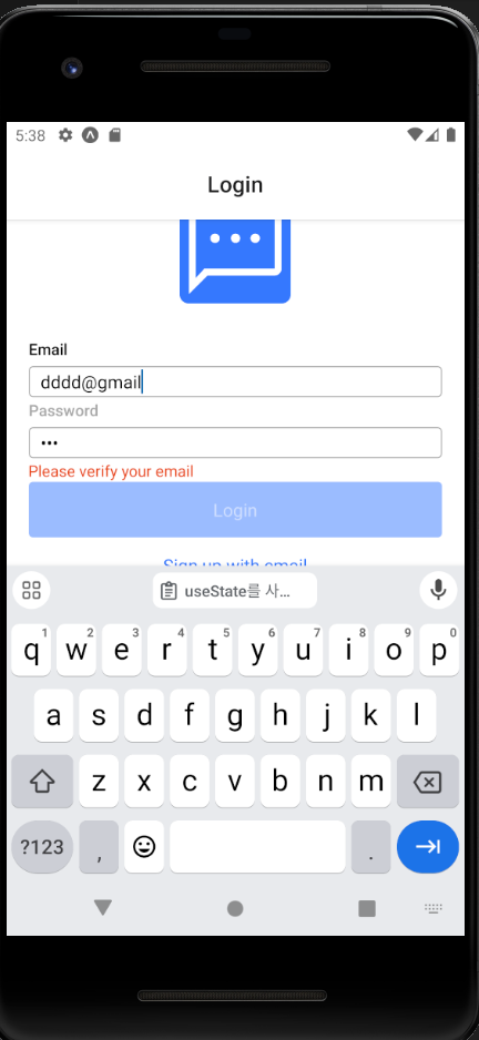
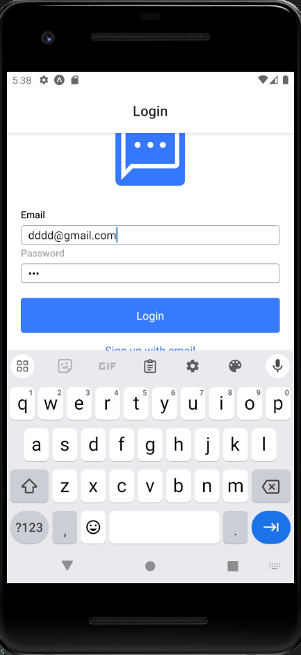
- validateEmail(changedEmail): 이메일이 유효한지 정규식으로 검사합니다. 유효하면 에러 메시지를 빈 문자열('')로 설정하고, 유효하지 않으면 'Please verify your email'라는 에러 메시지를 설정합니다.
- setErrorMessage(): 이메일 유효성 검사 결과에 따라 에러 메시지를 상태에 저장합니다.
-Button컴포넌트
import React from "react";
import styled from "styled-components";
import PropTypes from "prop-types";

const TRANSPARENT = 'transparent';

const Container = styled.TouchableOpacity`
  background-color: ${({ theme, isFilled }) =>
  isFilled ? theme.buttonBackground : TRANSPARENT};
  align-items: center;
  border-radius: 4px;
  width: 100%;
  padding: 10px;
  opacity: ${({ disabled }) => (disabled ? 0.5 : 1)};
`;

const Title = styled.Text`
  height: 30px;
  line-height: 30px;
  font-size: 16px;
  color: ${({ theme, isFilled}) =>
  isFilled ? theme.buttonTitle : theme.buttonUnfilledTitle};
`;

const Button = ({ containerStyle, title, onPress,  isFilled = true, disabled }) => {
    return (
        <Container
            style={containerStyle}
            onPress={onPress}
            isFilled={isFilled}
            disabled={disabled}
        >
            <Title isFilled={isFilled}>{title}</Title>
        </Container>
    );
};


Button.propTypes = {
    containerStyle: PropTypes.object,
    title: PropTypes.string,
    onPress: PropTypes.func.isRequired,
    isFilled: PropTypes.bool,
    disabled: PropTypes.bool,
};

export default Button;
props로 전달된 isFilled의 값에 따라 버튼 내부를 채우거나 투명하게 처리하는 Button 컴포 넌트를 만들었습니다. isFilled의 기본값을 true로 지정해서 색이 채워진 상태가 기본 상태로 되도록 하고, 버튼 내부가 채워지지 않았을 경우 props로 전달된 title의 색이 변경되도록 작 성했습니다. 사용되는 곳에 따라 버튼의 스타일을 수정하기 위해 containerstyle을 props로 전달받아 적용하도록 작성했습니다.
Button 컴포넌트에서 props를 통해 전달되는 disabled의 값에 따라 버튼 스타일이 변경되 도록 수정했습니다. Button 컴포넌트를 구성하는 TouchableOpacity 컴포넌트에 disabled 속성을 전달하면 값에 따라 클릭 등의 상호 작용이 동작하지 않기 때문에 disabled 값을 props로 전달하는 것으로 버튼 비활성화 기능을 추가했습니다.
//components/index.js
import Image from './Image';
import Input from './Input';
import Button from './Button';
export {Image, Input, Button };
//Login.js
import React, {useState,useRef, useEffect} from 'react';
import styled from 'styled-components/native';
import {Text} from 'react-native';
import {Image, Input, Button} from '../components/index';
import {images} from '../utils/images';
import { KeyboardAwareScrollView } from 'react-native-keyboard-aware-scroll-view';
import { validateEmail, removeWhitespace} from '../utils/common';

const Container = styled.View`
    flex: 1;
    justify-content: center;
    align-items: center;
    background-color: ${({theme}) => theme.background};
    padding: 20px;
`;

const ErrorText = styled.Text`
  align-items: flex-start;
  width: 100%;
  height: 20px;
  line-height: 20px;
  color: ${({theme}) => theme.errorText};
`;


const Login = ({navigation}) => {
  const [email, setEmail] =useState('');
  const [password, setPassword] = useState('');
  const passwordRef = useRef();
  const [errorMessage, setErrorMessage] = useState('');

  const [disabled, setDisabled] = useState(true);

  useEffect(()=>{
    setDisabled(!(email && password && !errorMessage));
  }, [email, password, errorMessage]);

  const _handleEmailChange = email => {
    const changedEmail = removeWhitespace(email);
    setEmail(changedEmail);
    setErrorMessage(
      validateEmail(changedEmail) ? '' : 'Please verify your email'
    );
  };
  const _handlePasswordChange = password => {
    setPassword(removeWhitespace(password));
  };

  const _handleLoginButtonPress = () => {};

  return (
    <KeyboardAwareScrollView
            contentContainerStyle={{ flex: 1}}
            extraScrollHeight={20}
        >
    <Container>
        <Image url={images.logo} imageStyle={{ borderRadius: 8 }} />
        <Input
          label="Email"
          value={email}
          onChangeText={_handleEmailChange}
          onSubmitEditing={() => {passwordRef.current.focus()}}
          placeholder="Email"
          returnKeyType="next"
        />

        <Input
          ref={passwordRef}
          label="Password"
          value={password}
          onChangeText={_handlePasswordChange}
          onSubmitEditing={_handleLoginButtonPress}
          placeholder="Password"
          returnKeyType="done"
          isPassword
        />
        <ErrorText>{errorMessage}</ErrorText>
        <Button title="Login" onPress={_handleLoginButtonPress} disabled={disabled}/>
        <Button
          title="Sign up with email"
          onPress={() => navigation.navigate('Signup')}
          isFilled={false}
        />
    </Container>
    </KeyboardAwareScrollView>
  )
}

export default Login
useState를 사용해 버튼의 활성화 상태를 관리하는 disabled# 생성하고 useEffect를 이용해 email, password, errorMessage의 상태가 변할 때마다 조건에 맞게 disabled의 상태가 변 경되도록 작성했습니다. 로그인 버튼은 이메일과 비밀번호가 입력되어 있고, 오류 메시지가 없 는 상태에서만 활성화되어야 합니다. 마지막으로 로그인 버튼의 Button 컴포넌트에 disabled 를 전달해서 값에 따라 버튼의 활성화 여부가 결정되도록 작성했습니다.
-로그인 화면 헤더 감추기
//navigations/AuthStack.js
import React, { useContext } from 'react';
import { ThemeContext } from 'styled-components/native';
import { createStackNavigator } from '@react-navigation/stack';
import { Login, Signup } from '../screens';

const Stack = createStackNavigator();

const AuthStack = () => {
    const theme = useContext(ThemeContext);

    return (
        <Stack.Navigator
            initialRouteName="Login"
            screenOptions={{
                headerTitleAlign: 'center',
                cardStyle: { backgroundColor: theme?.background },
                headerTintColor: theme.headerTintColor,
            }}
            options={{ headerBackTitleVisible: false }}
        >
            <Stack.Screen name="Login" component={Login} />
            <Stack.Screen name="Signup" component={Signup} />
        </Stack.Navigator>
    );
};

export default AuthStack;
회원가입 화면의 헤더에서 뒤로 가기 버튼의 타이틀을 감추고 헤더에서 사용되는 색을 하나로 통일시켰습니다.
- 노치 디자인 대응
내비게이션의 헤더를 감추면 노치 디자인에 대한 문제가 발생할 수 있습니다.
우리가 알고 있는 SafeAreaView 컴포넌트를 이용하는 방법 외에도 노치 디자인에 대응하기 위해 스타일에 설정해야 하는 padding값을 얻는 방법이 있습니다.
리액트 내비게이션 라이브 러리를 설치하는 과정에서 추가로 함께 설치한 react-native-safe-area-context 라이브러 리가 제공하는 useSafeArealnsets Hook 함수를 이용하면 됩니다.
import React, {useState,useRef, useEffect} from 'react';
import styled from 'styled-components/native';
import {Text} from 'react-native';
import {Image, Input, Button} from '../components/index';
import {images} from '../utils/images';
import { KeyboardAwareScrollView } from 'react-native-keyboard-aware-scroll-view';
import { validateEmail, removeWhitespace} from '../utils/common';
import {useSafeAreaInsets} from "react-native-safe-area-context";

const Container = styled.View`
    flex: 1;
    justify-content: center;
    align-items: center;
    background-color: ${({theme}) => theme.background};
    padding: 0 20px;
    padding-top: ${({ insets: { top }}) => top}px;
    padding-bottom: ${({insets : { bottom } }) => bottom}px;
`;

const ErrorText = styled.Text`
  align-items: flex-start;
  width: 100%;
  height: 20px;
  line-height: 20px;
  color: ${({theme}) => theme.errorText};
`;


const Login = ({navigation}) => {
  const insets = useSafeAreaInsets();
  const [email, setEmail] =useState('');
  const [password, setPassword] = useState('');
  const passwordRef = useRef();
  const [errorMessage, setErrorMessage] = useState('');

  const [disabled, setDisabled] = useState(true);

  useEffect(()=>{
    setDisabled(!(email && password && !errorMessage));
  }, [email, password, errorMessage]);

  const _handleEmailChange = email => {
    const changedEmail = removeWhitespace(email);
    setEmail(changedEmail);
    setErrorMessage(
      validateEmail(changedEmail) ? '' : 'Please verify your email'
    );
  };
  const _handlePasswordChange = password => {
    setPassword(removeWhitespace(password));
  };

  const _handleLoginButtonPress = () => {};

  return (
    <KeyboardAwareScrollView
            contentContainerStyle={{ flex: 1}}
            extraScrollHeight={20}
        >
    <Container insets={insets}>
        <Image url={images.logo} imageStyle={{ borderRadius: 8 }} />
        <Input
          label="Email"
          value={email}
          onChangeText={_handleEmailChange}
          onSubmitEditing={() => {passwordRef.current.focus()}}
          placeholder="Email"
          returnKeyType="next"
        />

        <Input
          ref={passwordRef}
          label="Password"
          value={password}
          onChangeText={_handlePasswordChange}
          onSubmitEditing={_handleLoginButtonPress}
          placeholder="Password"
          returnKeyType="done"
          isPassword
        />
        <ErrorText>{errorMessage}</ErrorText>
        <Button title="Login" onPress={_handleLoginButtonPress} disabled={disabled}/>
        <Button
          title="Sign up with email"
          onPress={() => navigation.navigate('Signup')}
          isFilled={false}
        />
    </Container>
    </KeyboardAwareScrollView>
  )
}

export default Login
노치 디자인을 해결하기 위해 padding의 top과 bottom의 값을 useSafeArealnsets 함 수가 알려주는 값만큼 설정하고, 양 옆은 우리의 디자인에 맞게 20Px로 설정했습니다. useSafeArealnsets 함수의 장점은 iOS뿐만 아니라 안드로이드에서도 적용 가능한 padding 값을 전달한다는 점입니다
useSafeAreainsets를 사용하면 조금 더 세밀하게, 원하는 곳에 원하는 만큼만 padding 을 설정해서 노치 디자인 문제를 해결할 수 있다는 장점이 있습니다
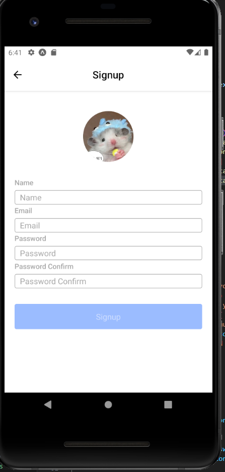
3) 회원가입 화면
회원가입 화면은 로그인 화면 제작 과정에서 만 든 컴포넌트를 재사용하면 굉장히 쉽고 빠르게 만들 수 있습니다
먼저 회원가입 화면에서 사용자의 사진을 원형으로 렌더링하기 위해 Image 컴포넌트에서 props를 통해 전달되는 값에 따라 이미지가 원형으로 렌더링되도록 수정합니다.
//components/Image.js
import React from 'react';
import styled from 'styled-components/native';
import PropTypes from 'prop-types';

const Container = styled.View`
    align-self: center;
    margin-bottom: 30px;
`
const StyledImage = styled.Image`
    background-color: ${({theme})=> theme.imageBackground};
    width: 100px;
    height: 100px;
    border-radius: ${({ rounded }) => (rounded ? 50 : 5)}px;
`

const Image = ({url, imageStyle, rounded=false}) => {
    return (
        <Container>
            <StyledImage source={{uri: url}} style={imageStyle} rounded={rounded}/>
        </Container>
    );

};

Image.propTypes = {
    uri: PropTypes.string,
    imageStyle: PropTypes.object,
    rounded: PropTypes.bool,
};

export default Image;
///screens/Signup.js
import React, { useState, useRef, useEffect } from 'react';
import styled from 'styled-components/native';
import { Image, Input, Button } from '../components';
import { KeyboardAwareScrollView } from 'react-native-keyboard-aware-scroll-view';
import { validateEmail, removeWhitespace } from '../utils/common';

const Container = styled.View`
  flex: 1;
  justify-content: center;
  align-items: center;
  background-color: ${({ theme }) => theme.background};
  padding: 0 20px;
`;

const ErrorText = styled.Text`
  align-items: flex-start;
  width: 100%;
  height: 20px;
  margin-bottom: 10px;
  line-height: 20px;
  color: ${({ theme }) => theme.errorText};
`;

const Signup = () => {
  const [name, setName] = useState('');
  const [email, setEmail] = useState('');
  const [password, setPassword] = useState('');
  const [passwordConfirm, setPasswordConfirm] = useState('');
  const [errorMessage, setErrorMessage] = useState('');
  const [disabled, setDisabled] = useState(true);

  const emailRef = useRef();
  const passwordRef = useRef();
  const passwordConfirmRef = useRef();

  useEffect(() => {
    let _errorMessage = '';
    if (!name) {
      _errorMessage = 'Please enter your name.';
    } else if (!validateEmail(email)) {
      _errorMessage = 'Please verify your email.';
    } else if (password.length < 6) {
      _errorMessage = 'The password must contain at least 6 characters.';
    } else if (password !== passwordConfirm) {
      _errorMessage = 'Passwords need to match.';
    } else {
      _errorMessage = '';
    }
    setErrorMessage(_errorMessage);
  }, [name, email, password, passwordConfirm]);

  useEffect(() => {
    setDisabled(!(name && email && password && passwordConfirm && !errorMessage));
  }, [name, email, password, passwordConfirm, errorMessage]);

  const _handleSignupButtonPress = () => {};

  return (
    <KeyboardAwareScrollView contentContainerStyle={{ flex: 1 }} extraScrollHeight={20}>
      <Container>
        <Image rounded />
        <Input
          label="Name"
          value={name}
          onChangeText={text => setName(text)}
          onSubmitEditing={() => {
            setName(name.trim());
            emailRef.current.focus();
          }}
          onBlur={() => setName(name.trim())}
          placeholder="Name"
          returnKeyType="next"
        />
        <Input
          ref={emailRef}
          label="Email"
          value={email}
          onChangeText={text => setEmail(removeWhitespace(text))}
          onSubmitEditing={() => passwordRef.current.focus()}
          placeholder="Email"
          returnKeyType="next"
        />
        <Input
          ref={passwordRef}
          label="Password"
          value={password}
          onChangeText={text => setPassword(removeWhitespace(text))}
          onSubmitEditing={() => passwordConfirmRef.current.focus()}
          placeholder="Password"
          returnKeyType="done"
          isPassword
        />
        <Input
          ref={passwordConfirmRef}
          label="Password Confirm"
          value={passwordConfirm}
          onChangeText={text => setPasswordConfirm(removeWhitespace(text))}
          onSubmitEditing={_handleSignupButtonPress}
          placeholder="Password Confirm"
          returnKeyType="done"
          isPassword
        />
        <ErrorText>{errorMessage}</ErrorText>
        <Button title="Signup" onPress={_handleSignupButtonPress} disabled={disabled} />
      </Container>
    </KeyboardAwareScrollView>
  );
};

export default Signup;
입력받아야 하는 값이 많아진 만큼 유효성 검사와 오류 메시지의 종류가 많아지므로 useEffect를 이용해 관련된 값이 변할 때마다 적적한 오류 메시지가 렌더링되도록 작성했습니다.
화면이 잘 구성된 것처럼 보이지만 기기의 크기에 따라 화면의 위아래가 잘려서 보이는 문제 가 있습니다. 또한, 아직 어떤 값도 입력하지 않았는데 오류 메시지가 렌더링되는문제도 있습 니다.
//Signup.js
import React, { useState, useRef, useEffect } from 'react';
import styled from 'styled-components/native';
import { Image, Input, Button } from '../components';
import { KeyboardAwareScrollView } from 'react-native-keyboard-aware-scroll-view';
import { validateEmail, removeWhitespace } from '../utils/common';

const Container = styled.View`
  justify-content: center;
  align-items: center;
  background-color: ${({ theme }) => theme.background};
  padding: 40px 20px;
`;

const ErrorText = styled.Text`
  align-items: flex-start;
  width: 100%;
  height: 20px;
  margin-bottom: 10px;
  line-height: 20px;
  color: ${({ theme }) => theme.errorText};
`;

const Signup = () => {
  const [name, setName] = useState('');
  const [email, setEmail] = useState('');
  const [password, setPassword] = useState('');
  const [passwordConfirm, setPasswordConfirm] = useState('');
  const [errorMessage, setErrorMessage] = useState('');
  const [disabled, setDisabled] = useState(true);

  const emailRef = useRef();
  const passwordRef = useRef();
  const passwordConfirmRef = useRef();
  const didMountRef = useRef();

  useEffect(() => {
    if (didMountRef.current) {
      let _errorMessage = '';
      if (!name) {
        _errorMessage = 'Please enter your name.';
      } else if (!validateEmail(email)) {
        _errorMessage = 'Please verify your email.';
      } else if (password.length < 6) {
        _errorMessage = 'The password must contain at least 6 characters.';
      } else if (password !== passwordConfirm) {
        _errorMessage = 'Passwords need to match.';
      } else {
        _errorMessage = '';
      }
      setErrorMessage(_errorMessage);
    } else {
    didMountRef.current = true;
    }
  }, [name, email, password, passwordConfirm]);

  useEffect(() => {
    setDisabled(!(name && email && password && passwordConfirm && !errorMessage));
  }, [name, email, password, passwordConfirm, errorMessage]);

  const _handleSignupButtonPress = () => {};

  return (
    <KeyboardAwareScrollView extraScrollHeight={20}>
      <Container>
        <Image rounded />
        <Input
          label="Name"
          value={name}
          onChangeText={text => setName(text)}
          onSubmitEditing={() => {
            setName(name.trim());
            emailRef.current.focus();
          }}
          onBlur={() => setName(name.trim())}
          placeholder="Name"
          returnKeyType="next"
        />
        <Input
          ref={emailRef}
          label="Email"
          value={email}
          onChangeText={text => setEmail(removeWhitespace(text))}
          onSubmitEditing={() => passwordRef.current.focus()}
          placeholder="Email"
          returnKeyType="next"
        />
        <Input
          ref={passwordRef}
          label="Password"
          value={password}
          onChangeText={text => setPassword(removeWhitespace(text))}
          onSubmitEditing={() => passwordConfirmRef.current.focus()}
          placeholder="Password"
          returnKeyType="done"
          isPassword
        />
        <Input
          ref={passwordConfirmRef}
          label="Password Confirm"
          value={passwordConfirm}
          onChangeText={text => setPasswordConfirm(removeWhitespace(text))}
          onSubmitEditing={_handleSignupButtonPress}
          placeholder="Password Confirm"
          returnKeyType="done"
          isPassword
        />
        <ErrorText>{errorMessage}</ErrorText>
        <Button title="Signup" onPress={_handleSignupButtonPress} disabled={disabled} />
      </Container>
    </KeyboardAwareScrollView>
  );
};

export default Signup;
- 화면 스크롤
KeyboardAwareScrollView 컴포넌트에 contentContainerStyle을 이용하여 “flex:l”을 스타일에 적용시키면서 내용이 화면을 넘어가는 문제 가 발생햇씁니다. flex: 1 스타일을 설정하면 컴포넌트가 차지하는 영역이 부모 컴포넌트 영역만큼으로 한정되므로, 컴포넌트의 크기에 따라 화면을 넘어가서 스 크롤이 생성되도록 flex:1을삭제합니다.
-오류 메시지
useEffect의 특성 때문에 컴포넌트가 마운 트될 때도 useEffect에 정의된 함수가 실행되면서 맨 처음 입력하지 않았을 때에도 오류 메시지가 나타납니다. useRef를 활용해 컴포넌트가 처음 마운트되었는지 여부를 추적하여 맨 처음 입력했을때는 오류 메시지가 뜨지 않도록 했습니다. 처음 마운트되었을 때 didMountRef.current가 undefined이기 때문에 가능합니다.
useState를 사용하면 값이 변경될 때마다 리렌더링이 발생하지만, useRef를 사용하면 리렌더링 없이 값을 유지할 수 있기 때문에 useRef를 사용했습니다.
- 사진 입력받기
firebase에 photo.png를 업로드하고 utils/images.js에 다음 내용을 저장합니다.
const prefix =
; //prefix는 그대로

export const images = {
    logo: `${prefix}/logo.png?alt=media`,
    photo: `${prefix}/photo.png?alt=media`,
};
보안규칙도 꼭 업데이트 해주어야 합니다.
rules_version = '2';

// Craft rules based on data in your Firestore database
// allow write: if firestore.get(
//    /databases/(default)/documents/users/$(request.auth.uid)).data.isAdmin;
service firebase.storage {
  match /b/{bucket}/o {
    match /logo.png {
  	allow read;
   }
    match /photo.png {
  	allow read;
   }
  }
}
//Signup.js
import {images} from '../utils/images';
 const Signup =()=>{
  const [photoUrl, setPhotoUrl] = useState(images.photo);
 		return (
 <KeyboardAwareScrollView extraScrollHeight={20}>
      <Container>
        <Image rounded url={photoUrl}/>

 );
}
npm install expo-image-picker
npx expo install expo-media-library
//components/Image.js
추가된 버튼은 Image 컴포넌트의 props로 전달되는 showButton의 값에 따라 렌더링 여부가 결정되도록 작성했습니다.
이렇게 하면 이미지 접근 허가에 대해 물어보고, 프로필에 첨부할 이미지를 삽입하는 버튼을 추가할 수 있습니다.
import React, {useEffect} from 'react';
import { Platform, Alert} from "react-native";
import * as ImagePicker from 'expo-image-picker';
import * as MediaLibrary from 'expo-media-library';
import styled from "styled-components/native";
import PropTypes from 'prop-types';
import {MaterialIcons} from '@expo/vector-icons';


const Container = styled.View`
  align-items: center;
  margin-bottom: 30px;

`;

const StyledImage = styled.Image`
  background-color: ${({ theme }) => theme.imageBackground};
  width: 100px;
  height: 100px;
  border-radius: ${({ rounded }) => (rounded ? 50 : 0)}px;
`;

const ButtonContainer = styled.TouchableOpacity`
  background-color: ${({ theme }) => theme.imageButtonBackgroud};
  position: absolute;
  bottom: 0;
  right: 0;
  width: 30px;
  height: 30px;
  border-radius: 15px;
  justify-content: center;
  align-items: center;
`;

const ButtonIcon = styled(MaterialIcons).attrs({
    name: 'photo-camera',
    size: 22,
})`
    color: ${({ theme }) => theme.imageButtonIcon};
`;

const PhotoButton = ({ onPress }) => {
    return (
        <ButtonContainer onPress={onPress}>
            <ButtonIcon />
        </ButtonContainer>
        )
}

const Image = ({
    url,
    imageStyle,
    rounded = false,
    showButton = false,
    onChangeImage = () => {}
  }) => {

    useEffect(() => {
        (async () => {
            try {
                if(Platform.OS !== 'web') {
                    const {status} =  await ImagePicker.requestMediaLibraryPermissionsAsync();
                    if(status !== 'granted') {
                        Alert.alert(
                            '사진 허가',
                            '사진첩 접근 허가를 해주세요~'
                        );
                    }
                }
            } catch (e){
                Alert.alert('사진 허가 요청 에러', e.message());
            }
        })();
    }, []);


    const _handleEditButton = async () => {
        try {
            const result = await ImagePicker.launchImageLibraryAsync({
                mmediaTypes: 'images',
                allowsEditing: true,
                aspect: [1, 1],
                quality: 1,
            });
            if(!result.cancelled) {
                onChangeImage(result.assets[0].uri);
            }
            console.log("Image URL:", result.assets[0].uri);
        }catch (e) {
            Alert.alert("사진 에러" , e.message);
        }
    };


    return (
        <Container>
            <StyledImage source={{uri: url }} style={imageStyle} rounded={rounded}/>
            {showButton && <PhotoButton onPress={_handleEditButton}/>}
        </Container>
    );
};

Image.defaultProps = {
    rounded: false,
    showButton: false,
    onChangeImage: () => {},
};

Image.propTypes = {
    url: PropTypes.string,
    imageStyle: PropTypes.object,
    rounded: PropTypes.bool,
    showButton: PropTypes.bool,
    onChangeImage: PropTypes.func,
}

export default Image;
//Signup.js
    <KeyboardAwareScrollView extraScrollHeight={20}>
      <Container>
        <Image rounded url={photoUrl} showButton
          onChangeImage={url => setPhotoUrl(url)}
        />
기기의 사진에 접근하는 함수는 결과를 반환하는데, 반환된 결과의 cancelled값을 통해 선택 여부를 확인할 수 있습니다. 만약 사용자가 사진을 선택했다면 반환된 결과의 uri를 통해 선택 된 사진의 주소를 알 수 있습니다
4) 로그인과회원가입
파이어베이스에서 사용자 추가를 합시다.
npm install firebase
//utils/firebase.js
import { initializeApp } from 'firebase/app';
import { getAuth, signInWithEmailAndPassword } from 'firebase/auth';
import config from '../../firebase.json';

// Initialize Firebase
const app = initializeApp(config);

// Initialize Authentication
const auth = getAuth(app);

export const login = async ({ email, password }) => {
  const { user } = await signInWithEmailAndPassword(auth, email, password);
  return user;
};

export const signup = async ({ email, password }) => {
  const { user } = await createUserWithEmailAndPassword(auth, email, password);
  return user;
};

export default app;
//Login.js
import {Alert} from 'react-native';
import {login} from '../utils/firebase';

//,...

  const _handleLoginButtonPress = async() => {
    try{
      const user = await login({email, password});
      Alert.alert('login success',user.email);
    }catch(e){
      Alert.alert('login error', e.message);
    }

  };
//Signup.js
import {Alert} from 'react-native';
import {login} from '../utils/firebase';

//...

  const _handleSignupButtonPress = async() => {
    try {
      const user = await signup({ email, password });
      console.log(user);
      Alert.alert('Signup Success', `User email: ${user.email}`);
    } catch (e) {
      Alert.alert('Signup Error', e.message);
    }

  };
사용자 이름은 문자열로 입력할 수 있지만, 사진은 약간의 변화가 필요합니다. 라이브러리를 이용해서 받은 선택된 사진의 내용은 “file://...”로 진행되는 값을 갖고 있어 바로 사용할 수 없습니다. 이 문제는 사용자에 의해 선택된 사진을 스토리지에 업로드하고 업로드된 사진의 url 을 이용하는 방법으로 해결할 수 있습니다. 이번에는 사진을 스토리지에 업로드하는 함수를 만 들고 signup 함수를 수정해서 생성되는 사용자의 사진과 이름을 설정하도록 수정하겠습니다.
//firebase.js
import { initializeApp } from 'firebase/app';
import {
  getAuth,
  signInWithEmailAndPassword,
  createUserWithEmailAndPassword,
  signOut,
  updateProfile,
} from 'firebase/auth';
import { getDownloadURL, getStorage, ref, uploadBytes } from 'firebase/storage';
import config from '../../firebase.json';

export const app = initializeApp(config);

const auth = getAuth(app);

export const signin = async ({ email, password }) => {
  const { user } = await signInWithEmailAndPassword(auth, email, password);
  return user;
};

const uploadImage = async uri => {
  if (uri.startsWith('https')) {
    return uri;
  }

  const response = await fetch(uri);
  const blob = await response.blob();

  const { uid } = auth.currentUser;
  const storage = getStorage(app);
  const storageRef = ref(storage, `/profile/${uid}/photo.png`);
  await uploadBytes(storageRef, blob, {
    contentType: 'image/png',
  });

  return await getDownloadURL(storageRef);
};

export const signup = async ({ name, email, password, photoUrl }) => {
  const { user } = await createUserWithEmailAndPassword(auth, email, password);
  const photoURL = await uploadImage(photoUrl);
  await updateProfile(auth.currentUser, { displayName: name, photoURL });
  return user;
};

export const getCurrentUser = () => {
  const { uid, displayName, email, photoURL } = auth.currentUser;
  return { uid, name: displayName, email, photoUrl: photoURL };
};

export const updateUserInfo = async photo => {
  const photoUrl = await uploadImage(photo);
  await updateProfile(auth.currentUser, { photoUrl });
  return photoUrl;
};

export const signout = async () => {
  await signOut(auth);
  return {};
};
uploadImage 함수는 Firebase Storage에 사용자의 UID를 이용해 사진을 업로드하고, 해당 이미지의 다운로드 URL을 반환합니다. signup 함수는 사용자의 이메일, 비밀번호, 이름, 그리고 사진 URL을 받아 처리하며, 사용자가 사진을 선택하지 않으면 기본 이미지의 URL을 사용하여 업로드를 생략합니다. 이를 통해 사용자의 프로필 사진을 고유하게 관리하고, Firebase Storage에서 쉽게 접근할 수 있도록 합니다.
//Signup.js
  const _handleSignupButtonPress = async() => {
    try {
      const user = await signup({ email, password, name, photoUrl });
      console.log(user);
      Alert.alert('Signup Success', `User email: ${user.email}`);
    } catch (e) {
      Alert.alert('Signup Error', e.message);
    }

  };
이제 storage 보안규칙을 바꿉니다.
rules_version = '2';

// Craft rules based on data in your Firestore database
// allow write: if firestore.get(
//    /databases/(default)/documents/users/$(request.auth.uid)).data.isAdmin;

service firebase.storage {
  match /b/{bucket}/o {
    match /profile/{userId}/photo.png {
      allow read;
      allow write: if request.auth.uid == userId;
    }
    match /logo.png {
      allow read;
    }
    match /photo.png {
      allow read;
    }
  }
}
-spinner 컴포넌트
이번에는 로그인 혹은 회원가입이 진행되는 동안 데이터를 수정하거나 버튼을 추가로 클릭하 는 일이 발생하지 않도록 Spinner 컴포넌트를 만들어 사용자의 잘못된 입력이나 클릭을 방지하 는 기능을 만들어보겠습니다.
//components/Spinner.js
import React, { useContext } from 'react';
import { ActivityIndicator } from 'react-native';
import styled, { ThemeContext } from 'styled-components/native';

const Container = styled.View`
  position: absolute;
  z-index: 2;
  opacity: 0.3;
  width: 100%;
  height: 100%;
  justify-content: center;
  background-color: ${({ theme }) => theme.spinnerBackground};
`;

const Spinner = () => {
  const theme = useContext(ThemeContext);
  return (
    <Container>
      <ActivityIndicator size={'large'} color={theme.spinnerIndicator} />
    </Container>
  );
};

export default Spinner;
//components/index.js
import Image from './Image';
import Input from './Input';
import Button from './Button';
import Spinner from './Spinner';
export {Image, Input, Button, Spinner };
//navigations/index.js
import React from 'react';
import { NavigationContainer } from '@react-navigation/native';
import AuthStack from './AuthStack';
import { Spinner } from '../components';

const Navigation = () => {
    return (
        <>
            <AuthStack />
            <Spinner />
        </>
    );
};

export default Navigation;
Spinner 컴포넌트는 로그인 버튼을 클릭했을 때나 회원가입 버튼을 클릭했을 때처럼 여러 화 면에서 발생하는 특정 상황에서만 렌더링되어야 합니다. 우리는 이렇게 여러 화면에서 하나의 상태를 이용하기 위해 전역적으로 상태를 관리하는 방법으로 Context API를 알고 있습니다. 이번에는 Context API를 이용해 Spinner 컴포넌트의 렌더링 상태를 전역적으로 관리하도록 만들어보겠습니다 . 먼저 contexts 폴더 안에 Progress.js 파일을 생성하고 다음과 같이 작성합니다
import React, { useState, createContext } from 'react';

const ProgressContext = createContext({
  inProgress: false,
  spinner: () => {},
});

const ProgressProvider = ({ children }) => {
  const [inProgress, setInProgress] = useState(false);
  const spinner = {
    start: () => setInProgress(true),
    stop: () => setInProgress(false),
  };
  const value = { inProgress, spinner };
  return (
    <ProgressContext.Provider value={value}>
      {children}
    </ProgressContext.Provider>
  );
};

export { ProgressContext, ProgressProvider };
//contexts/index.js
 import { ProgressContext, ProgressProvider } from './Progress';
 export { ProgressContext, ProgressProvider };
//App.js
import { ProgressProvider } from './contexts';

//...
  return isReady ? (
    <ThemeProvider theme={theme}>
      <ProgressProvider>
        <StatusBar barStyle="dark-content" />
        <Navigation />
      </ProgressProvider>
    </ThemeProvider>
  ) : (
    <AppLoading startAsync={_loadAssets} onFinish={() => setIsReady(true)} onError={console.warn} />
  );
};
꼭 ProgressProvider로 감싸줘야 합니다.
//navigations/index.js
import React from 'react';
import { NavigationContainer } from '@react-navigation/native';
import AuthStack from './AuthStack';
import { Spinner } from '../components';
import { ProgressProvider } from '../contexts';


const Navigation = () => {
    const { inProgress } = useContext(ProgressContext);
    return (
        <>
            <AuthStack />
            {inProgress && <Spinner />}
        </>
    );
};

export default Navigation;
createContext 함수# 이용해 Context# 생성하고, Provider 컴포넌트의 value에 Spinner 컴포넌트의 렌더링 상태를 관리할 inProgress 상태 변수와 상태를 변경할 수 있는 함수를 전 달했습니다. 상태를 변경하는 함수는 사용자가 명확하게 렌더링 여부를 관리할 수 있도록 start 함수와 stop 함수를 만들어서 전달했습니다
'대외활동 > 멋쟁이사자처럼_프론트엔드 12기' 카테고리의 다른 글
| 트러블 슈팅. Command failed with exit code 1: gradlew.bat app: DRACONIST (0) | 2025.02.15 |
|---|---|
| REACT NATIVE 스터디. 4주차-9장. 채팅 어플리케이션2 메인화면 DRACONIST (1) | 2025.02.06 |
| <트러블슈팅>react native navigation DRACONIST (0) | 2025.02.05 |
| REACT NATIVE 스터디. 3주차 퀴즈 DRACONIST (0) | 2025.01.30 |
| REACT NATIVE 스터디. 3주차 8단원. Navigation DRACONIST (0) | 2025.01.30 |

